Blue View (2024)
was a fantasy product created by team OurBlues, a “window” that is reactive to the user’s music and transforms the vibes of the user’s bedroom.
Team
Angie Mendenhall: Hardware Engineer and Experience Designer
Yawen Xiao: Producer and UI/UX Designer
Cassie Lin: UI/UX and Graphic Designer
Annie Li: Software Engineer
Anna Kim: UI/UX Researcher and Designer
Kira Chen: UI/UX Designer and Artist
Experience Goals
> To make guests feel saddness.
> To allow guests to fall into a meditative state.
> To transform the guest's personal space into something that matches their personality.
Technology
> Monitor and Fresnel Lenses
> Adaptive Visuals to Music
> Unity Project Show Control
What Was Blue View?
OurBlues was a team sponsored by Deeplocal to allow ETC students to experience what it is like to work in a creative technology and experience design firm. The prompt for the team is to create a “self-contained product that elevates the personal spaces where Gen Z can tap into their feelings with sad music, transforming the space based on their unique music taste.” This fantasy product is part of a larger marketing campaign and would be delivered to online influencers. To understand how to build a marketing campaign such as this, we picked Spotify as the brand we were representing. We are not affiliated with Spotify, we do however use their "brand langauge" to emulate what it would be like to work with a brand. We created the BlueView, a “window to your music,” which would be installed next to the bed of a user. This window displays a scrolling landscape that reacts and changes to the music played by the user and has shifting environments based on data from each song. We used LED screens and lenses in unique ways to explore how to make flat surface look and feel like a real window. Our project blog can be found here.
Process
Brainstorming
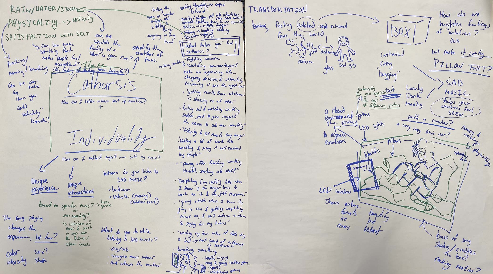
When we were given our prompt, I spent a lot of time dissecting what elements were important and what emotions we wanted to emphasize. I asked my friends and classmates what they liked to do when they listened to sad music, where they listened to it, why did they listen to it, and what they thought of. With this information, I was able to form a few ideas on what direction the project should take. One of them was a pillow fort box that a guest could sit in and watch the world pass by from a window in the box, which is similar to the direction the project ended up taking.
Concert in your Bedroom
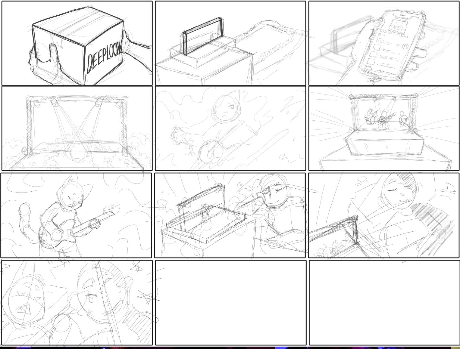
We pitched multiple ideas to our client, besides what became the Blue View. One of these was a “concert in your bedroom,” with a small character that would vibe to your music with you. Here is a storyboard that I created for this experience.
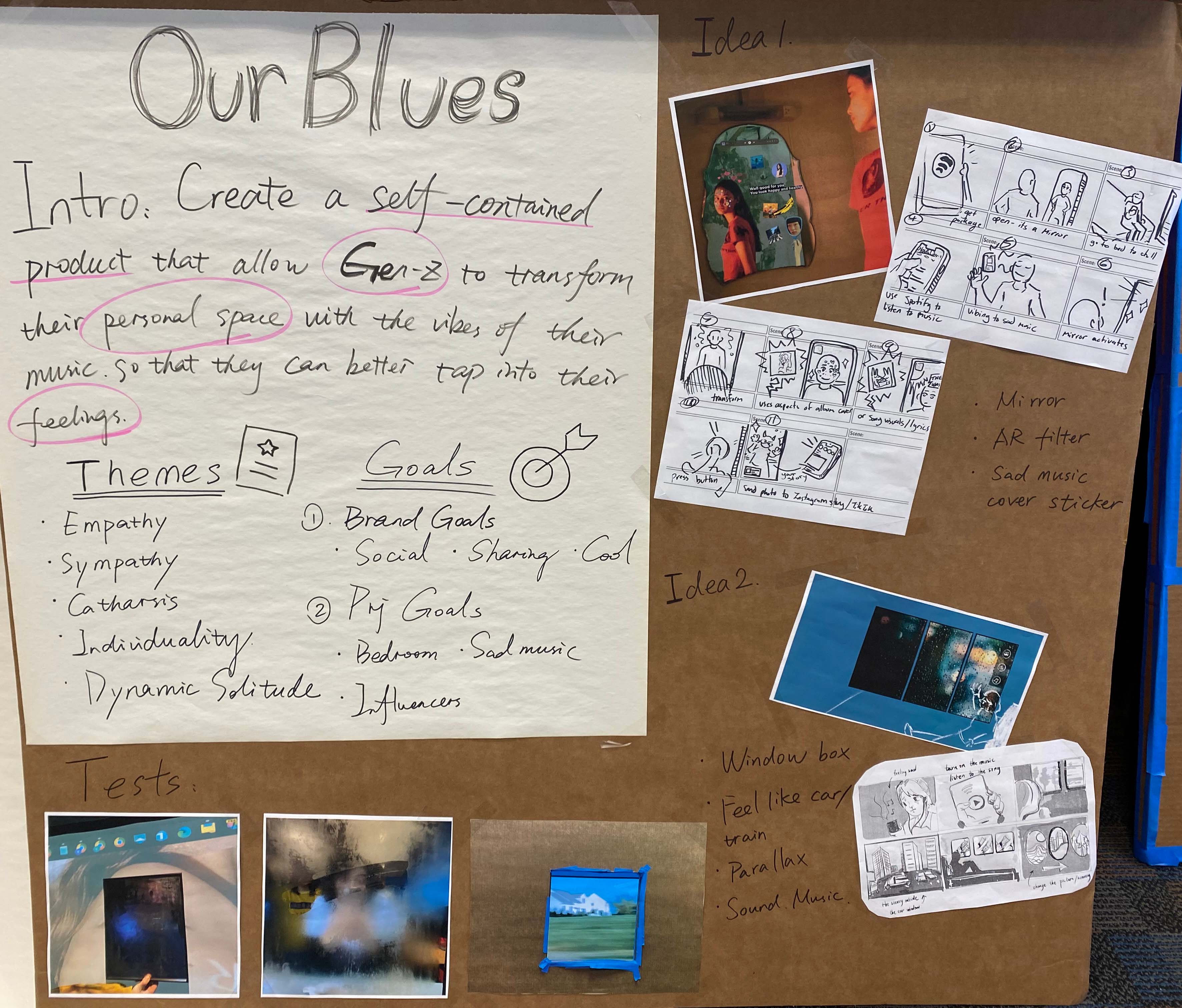
Idea Board
For the faculty walkarounds, we were debating between two directions. We liked both and felt they both fit the brief, yet we were not sure what would be the best for our project. We decided to use the faculty walkarounds as a way to ask what the better opportunity for the team would be and what the faculty felt was the better fit for the project. I created a storyboard of one of the directions, which was a smart mirror that would generate filters based on the song you were listening to. We got a lot of useful feedback from this!
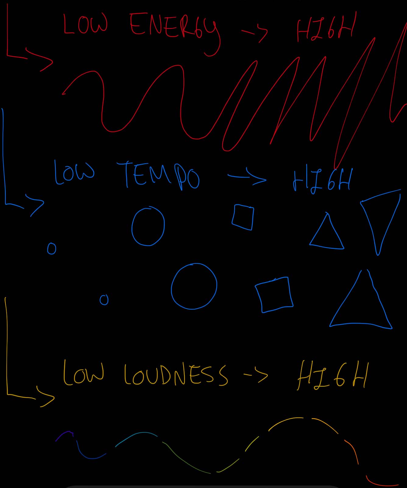
Parameterized Music
Once we solidified the window idea, I researched the Spotify API to see how it gathers data from songs. I learned that it separated songs in sections using timestamps, as well as having average data for information such as tempo, loudness, and energy. With these points, I created a demo video of how we could parameterize songs. I created a simple chart with colors and shapes, and animated the appropriate colors/shapes to values in Procreate. You can watch the demo video here.
Small Fresnel Lens
I ordered a small Fresnel lens, after doing a lot of research online on how to make a fake window look real, to see how it would look with footage of a moving vehicle. The result was great, the moving imagery really sold the effect, especially when close to the lens. We did some testing with this lens and moving vehicle content, and while some liked the abstraction due to the distortion, it made several people motion sick. I spent a lot of time after this exploring how to reduce distortion.
Midterm Presentation
Here is our team's midterm presentation, going over what we have done so far and what we plan to do for the rest of the semester.
Experiments with the Fresnel Lens
After our midterm presentation, I worked with the Fresnel lens to see how to reduce distortion. I discovered that certain media to lens to viewer distances helped distortion considerably, while still having the fishbowl effect we wanted. I was also able to combine the small Fresnel lens with a Fresnel lens we scavenged from a television, which didn’t magnify as much as the small lens, but blurred the screen a bit. This was beneficial as it hid the pixels that were being magnified from the lens.
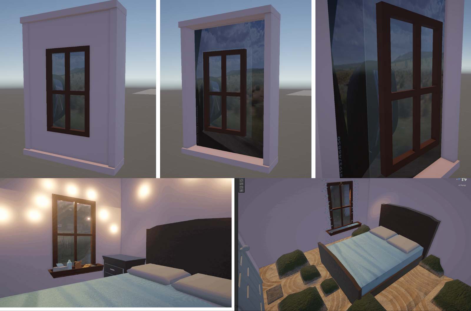
Digital Mockup
I created a mockup of how our window could be housed. I was playing with the idea of building it in a self-contained box, so we could have it fit into the idea of being a more self-contained product, but we decided it would be cleaner if we built our own set wall and built it into that. This changed the way our marketing campaign is phrased, now being a “Spotify came to my house and installed this window!” rather than something sent in the mail.
Large Fresnel Lens
Once I got the large Fresnel lens in the mail, I did several experiments to learn how it differs from the smaller one. It has a blurry, washed-out look, which works well for the dreamy angle of our project. It makes everything feel softer and more relaxed. The fishbowl effect is slightly less because the larger lens has to be farther away to get similar results to the small lens, but this also eliminates distortion more.
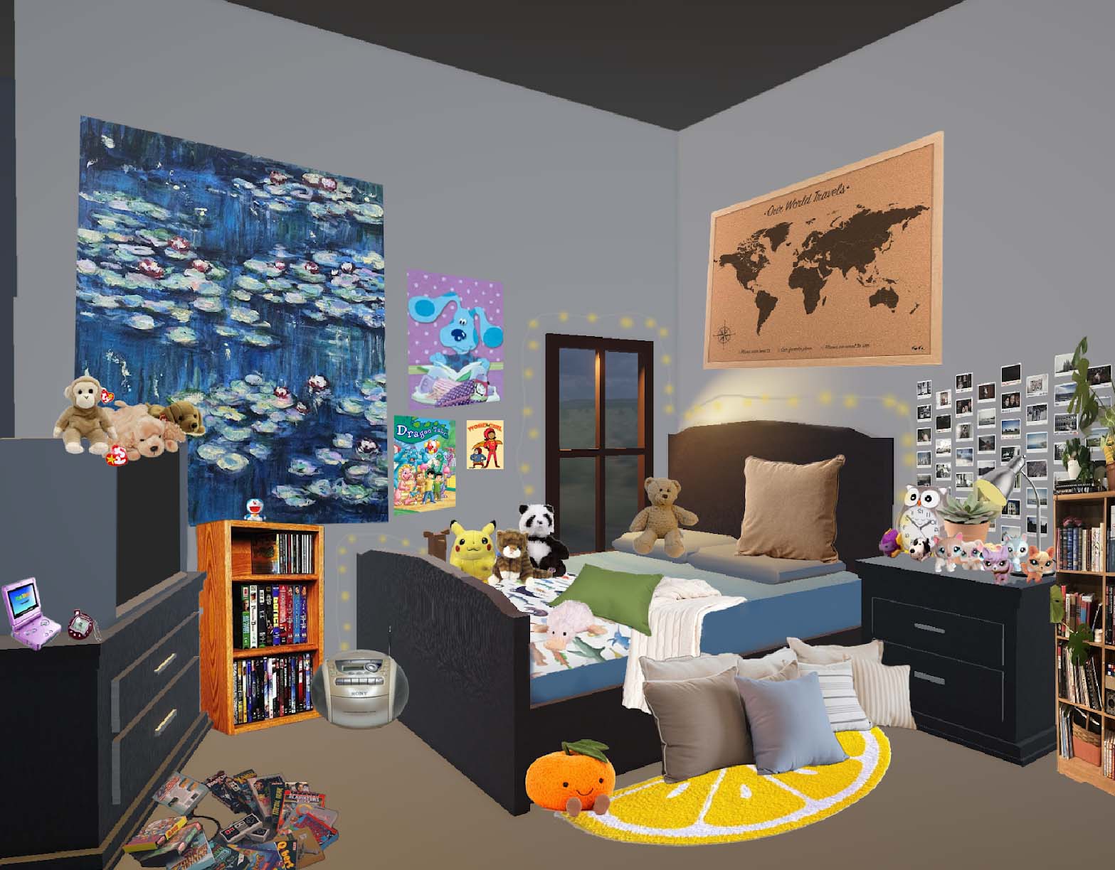
Installation Concept Art
I then collaborated with Cassie to create a mockup of what our space could look like. We want to have two walls of a neutral color, the longer one on the long side of the bed, to build our own corner. We also thought about the vibes we wanted the space to have, making sure it felt like a personalized bedroom as well as a cool space for influencers, and put these ideas into the concept art I created.
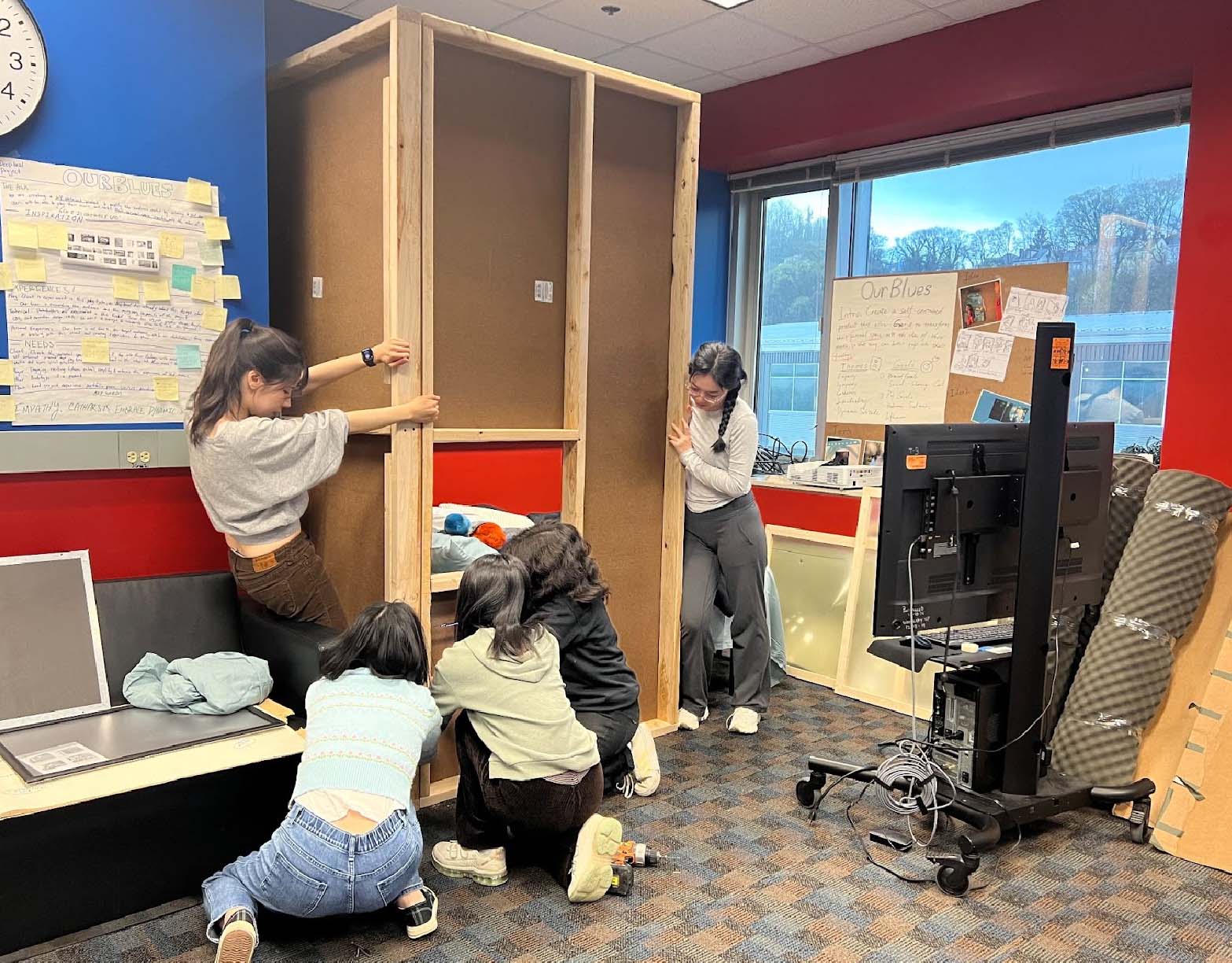
Building the Installation
I also built the real-life wall that we would use for our window with help from Cassie. I never built a set wall before, so it was fun to learn! I got help from faculty from the ETC on the design to make the wall freestanding as well as what material we should use for the sheathing. I cut the wood and put everything together myself.
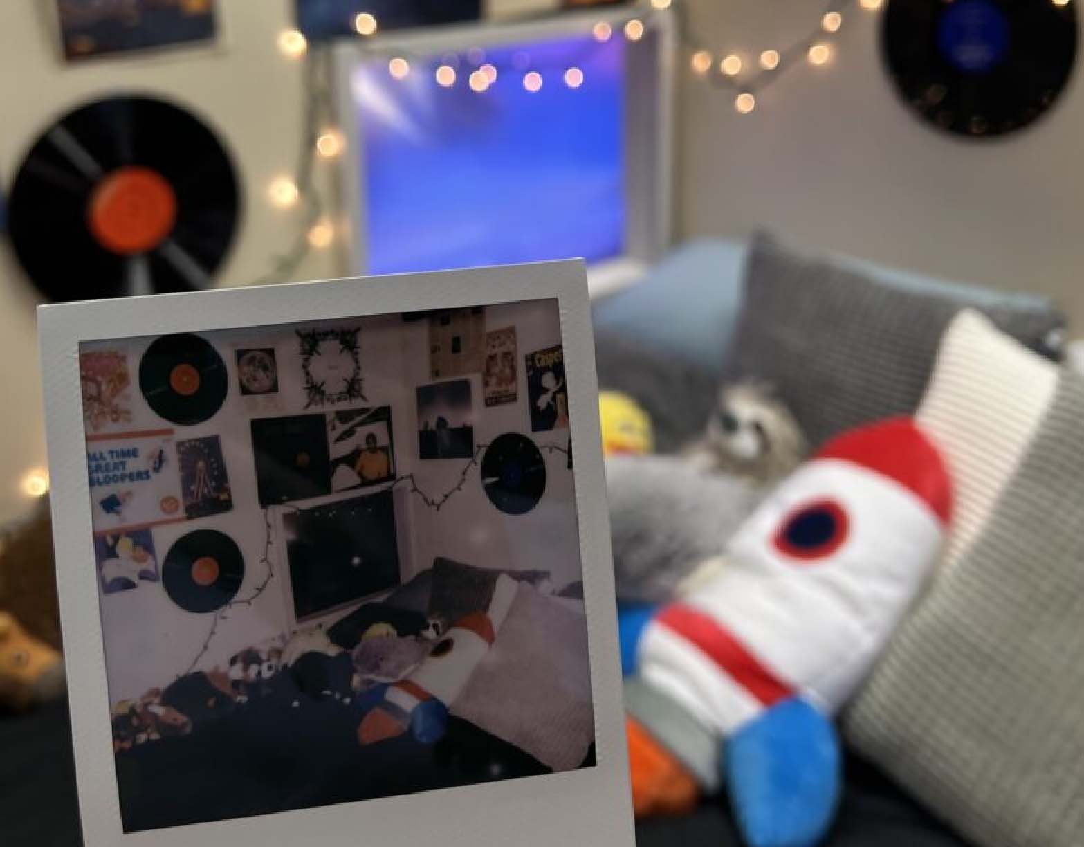
Final Space
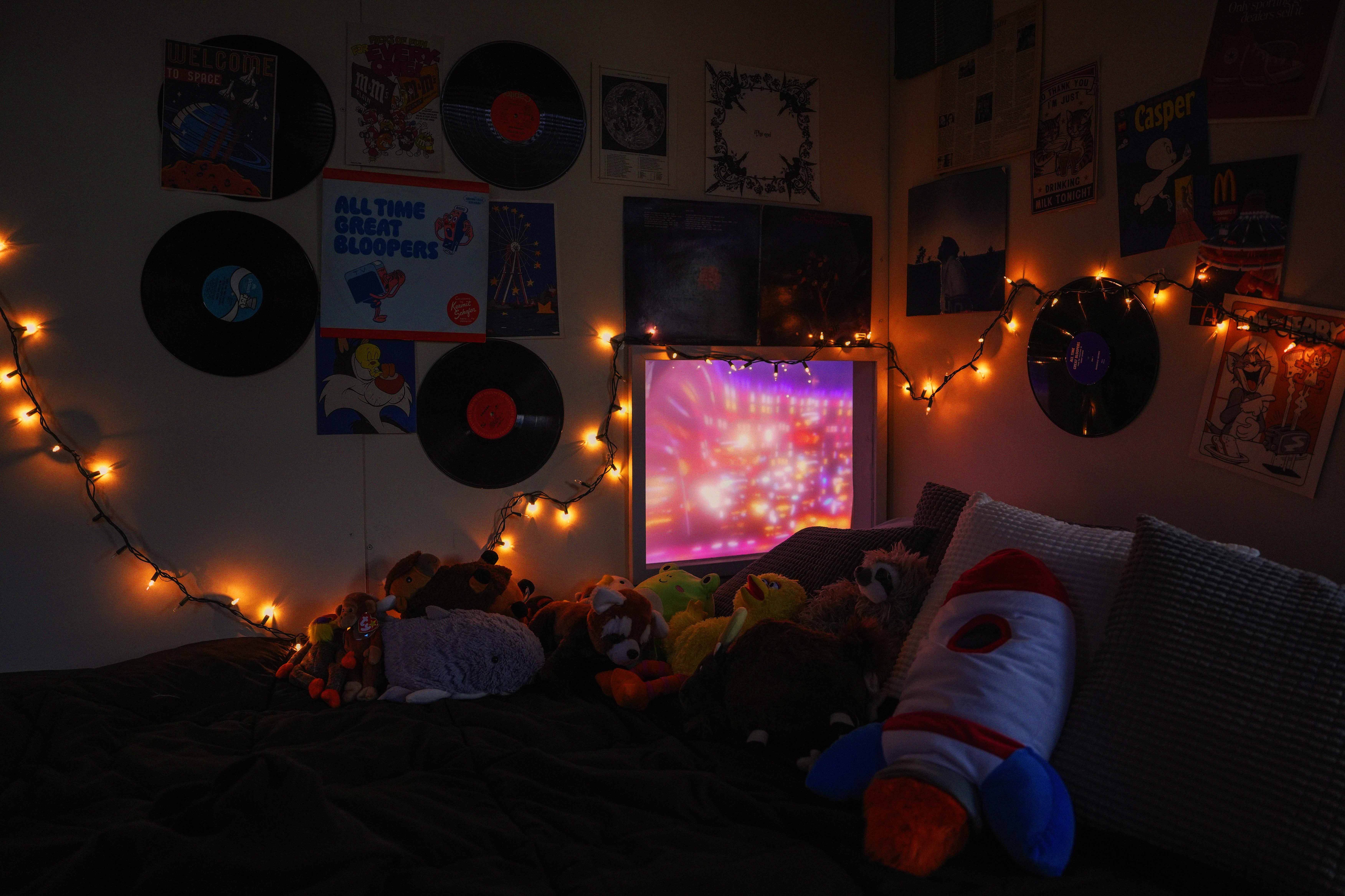
We painted and decorated the wall as a team, leaning into the music/retro aesthetic from the earlier concept art. We also were given a bunch of stuffed animals to decorate with, making our space feel comfortable.
Blue View Trailer
Anna and Cassie created this trailer which captures the purpose of how project and the final result. Watch the trailer here.
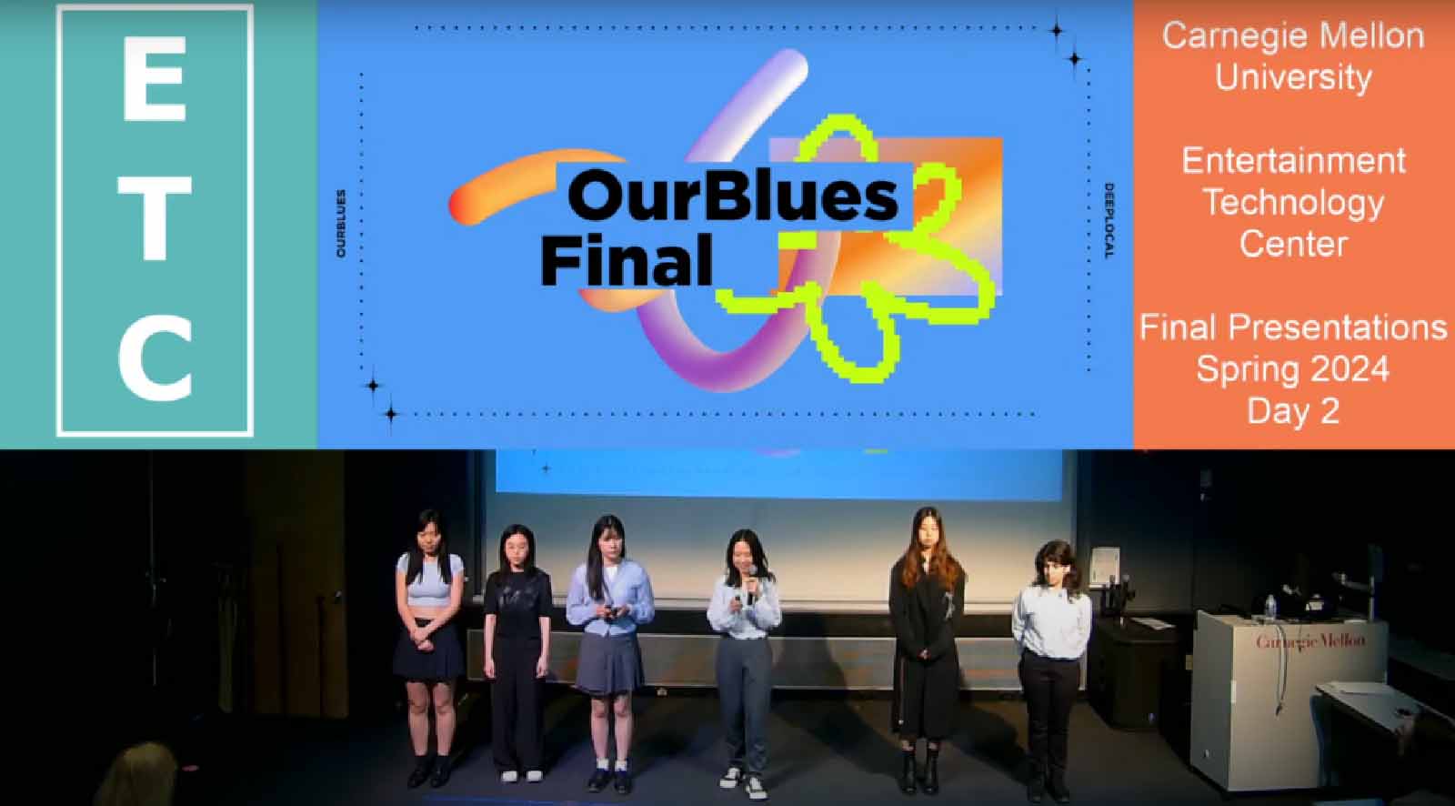
OurBlues Final Presentation
This is the final presentation we gave to ETC faculty, recapping the project as a post mortem. Watch the presentation here.
